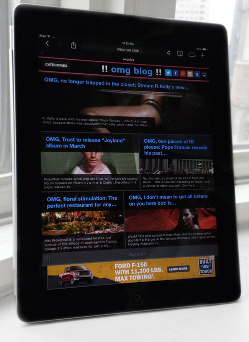
Now you can take !!omg blog !! with you anywhere you take your iPad, iPhone or iPod Touch when you browse the site on the new touch-optimized version of the site.
Just type omgblog.com into your Safari or Chrome mobile browser and it will take you there. Android version is coming soon!
How to use it: Touch an article to open, swipe to the side to advance a page, and touch the upper left to return to the home page.
We hope you enjoy the new design, but if you prefer the original desktop version, you can opt out by following this link in your mobile browser or clicking this icon in the upper right:
![]()
If you have issues using the new optimized site or any other feedback (positive or negative), please comment on this post. The design will be evolving over the coming weeks and we will take your comments into account.
PLEASE NOTE: “Candy” and other NSFW posts can only be viewed and comments can only be left on the desktop version of the site.

Hi Dave, at this time you can only leave comments on the desktop version of the site. Comments for the touch-optimized site are being looked into for an upcoming release. As I mentioned you can bookmark the desktop version link and use that if you really don’t like using the touch version. xo Frank
Onswipe is awful. I would cut your losses and back out of trying to use it. It makes sites slow, use up more memory (more frequently takes other Safari tabs and apps out of memory), the interface is confusing, it uses a stupid empty side menu just for a link to switch to the desktop version, it often messes up posts that have video that work when onswipe is disabled, its touch transitions are janky. I could go on and on. I’m a huge iPad fan, have had almost every model since the first one came out, and I really hate any site that uses it.
I don’t like mobile sites on my iPad. The desktops are so much better and easier to use. I also find that the videos don’t always play and that the site gets stuck on certain pages. . Can you please stop automatically making my iPad go straight to mobile? It’s really annoying and if I need to keep switching back, I will probably stop looking at this.
Thanks Frank, for the explanation. But onswipe has consistently been harder to navigate on my ipad. It takes you to ads that you can’t back out of or close, leaving no alternative than reopen the site’s homepage. I’ve tried to work with onswipe on other sites, but unless I’m doing something wrong, it makes it difficultt to browse the site. For instance, when opening an article through onswipe, where are the comments? Unless I’m overlooking something, i have to navigate to the regular version of the site to see the comments. Is there something I’m missing? Dave
Hi David and Peter, thanks for your comments!
We’re just in the testing phase with Onswipe and will be taking everyone’s feedback into account. If you really hate it, you can bookmark this link on your iPad or iPhone: http://synapse.onswipe.com/v2/optout/?usr=omgblog&ref=https://omg.blog/
I can share that Onswipe has some big improvements in the pipeline, so I hope you’ll give it a chance!
xo Frank
Guys, “onswipe” sucks. Every site I visit on my ipad/iphone that uses onswipe now makes me go through the extra step of opting for the desktop version. (And I had to go to the desktop version to leave this comment.) Why switch to this? It doesn’t make anything easier or better. It’s worse. Just my two cents.
Why do you have i and Android optimised versions?
Surely all you need is to use web standards and a responsive design utilising CSS media queries – in order to support any mobile device that has a modern browser, i.e. just about all mobile devices.