
Sometimes companies are so busy pumping out Christmas merchandise, they forget to take a step back and think twice! Check out these holiday product design FAILS after the NSFW jump! Which one is at the top of your list as the worst!?
�
CLICK TO ENLARGE!


[via sadanduseless]
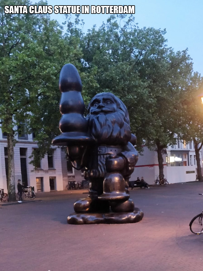
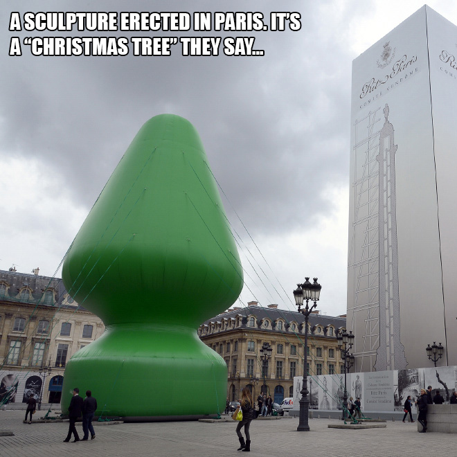
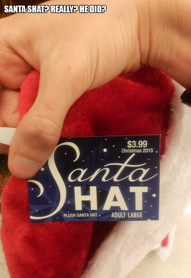
well some of them are intended to be like this and not a fail. the 1st one probably is in spain and is meant to be poo due to caganer tradition. and the buttplug statues in rotterdam and paris are indeed representing buttplugs. you can google the artists.
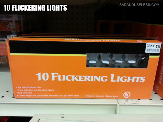
The joke is that the “L” and “I” look like a “U” from a distance.
The “LI” in flickering looks like a “U”
I believe it’s included because if one just glances at the name on the box, “flickering” looks like “fuckering”?
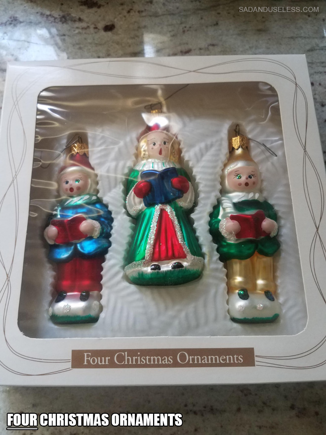
Love these, but I don’t understand the last one. Are there only four lights in the package?
Hey Doug, the problem with the last one is in the word “flickering.” The words are put together so close that the “l” and “i” look like a “u” making the word “fuckering.”
The front makes it look like it says fuckering lights
I think the joke is that it’s easy to misread the “LI” in “FLICKERING” as a “U”.
At first glance, I thought it said FUCKERING.
10 FUCKERING LIGHTS
The “L” and “I” in “Flickering” look like the letter “U” when placed too near each other.
The package says: FUCKERING LIGHTS